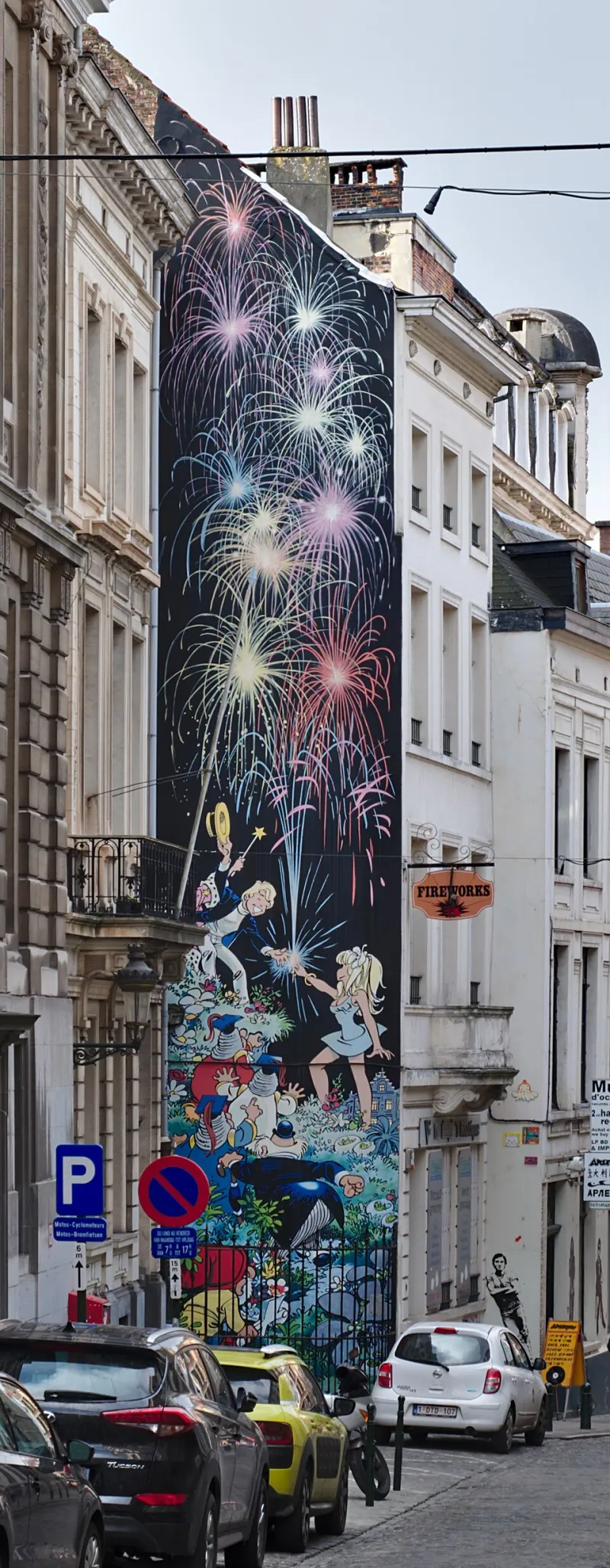
When the Art Does the Talking: How Indie Comics Creators Craft Panels That Hit Like a Gut Punch
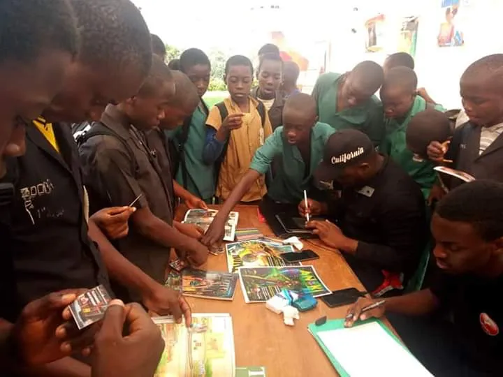
Photo: Egyioh, CC BY-SA 4.0, via Wikimedia Commons
You know the feeling. You're reading, you're moving, and then—full stop. Something on the page grabs you by the collar and doesn't let go. No caption box. No speech bubble. Just an image doing work that a thousand words couldn't finish. In indie comics, those moments aren't accidents. They're decisions, layered and deliberate, made by creators who've figured out that the most powerful thing a panel can do is make you feel before you think.
We spent time talking to independent creators whose visual work has spread far beyond their original readership—shared in design circles, screenshot into mood boards, debated in Reddit threads—to understand exactly what goes into building that kind of moment. What we found is that the freedom indie publishing gives you isn't just philosophical. It shows up directly in the art.
Composition Is the First Conversation
Before color, before line weight, before anything else, there's where you put things. Composition is the silent contract a creator makes with the reader's eye, and indie artists are playing with that contract in ways corporate books rarely attempt.
Take the work of creators who deliberately break the rule of thirds—not out of ignorance, but to create unease. When a figure is pressed hard into a corner of the frame with negative space yawning open beside them, that emptiness means something. It communicates isolation, threat, or grief without a single word. Big publishers have house styles. They have editors trained to correct what looks "off." Independent creators don't have that filter, and that's exactly why their compositions can go somewhere unexpected.
"I was told early on that my panels were 'too empty,'" says one webcomic creator whose work has racked up tens of thousands of shares across social platforms. "But that empty space was the loneliness I was trying to show. When you take it out, you take out the whole point."
The lesson? Negative space isn't the absence of a choice. It is the choice.
Color Theory Isn't Just Pretty—It's Psychological
Color in comics does double duty. It sets mood, sure, but it also guides attention, signals time and memory, and can flip the emotional meaning of a scene entirely. Indie creators are increasingly using color as a narrative layer rather than a finishing coat.
One approach that's been turning heads: desaturating everything in a scene except for one specific object or character. The eye goes there immediately. No arrow needed, no caption directing your gaze. The storytelling is baked into the palette itself. It's a technique borrowed loosely from film—think Schindler's List's red coat—but indie comics artists are applying it panel-by-panel in ways that feel entirely native to the medium.
Other creators use color temperature to track emotional arcs across an entire book. Warm tones during connection and safety, cool tones during isolation or threat. By the time a reader consciously notices the shift, they've already felt it for twenty pages.
"I don't write color notes for every panel," one artist explains. "I write emotional notes. Then the color follows from that. If I know a character is starting to dissociate, the palette starts going grey-blue. It's not about what looks cool. It's about what's true to the moment."
Pacing Is a Visual Decision, Not Just a Writing One
Here's something that gets underappreciated: the size of a panel is a pacing tool. A wide, sprawling image tells your brain to slow down. A tight stack of small panels creates urgency, even panic. Indie creators who understand this are essentially editing the speed at which you read their book—and that control is enormously powerful.
The "silent sequence" has become something of a calling card for indie visual storytelling. No words across four, five, six panels. Just bodies in space, expressions, movement, light. Done well, these sequences hit harder than any dialogue-heavy exchange. Done poorly, they're just confusing. The difference almost always comes down to whether the creator trusts the reader—and whether they trust themselves.
"Corporate books have a certain words-per-page expectation," one creator notes. "When you're independent, you can give a single image an entire page and nobody's stopping you. Sometimes the story needs to breathe. Sometimes it needs to scream quietly."
Line Weight and the Illusion of Depth
This one's technical, but it matters: how thick or thin a line is tells your eye what's important and what's background. Heavy outlines on foreground characters, lighter or even broken lines on objects further back—it's a trick as old as printmaking, but indie artists are pushing it into expressive territory that goes way beyond depth simulation.
Some creators deliberately apply thick, jagged line weight during moments of emotional intensity and switch to thin, clean lines during calm. The style itself becomes a mood indicator. Readers pick up on it subconsciously, and when it's consistent, it builds a kind of visual vocabulary specific to that book—a grammar the reader learns without realizing it.
This is exactly the kind of systemic visual decision that gets standardized out of corporate comics. Style guides exist to keep books consistent across creative teams. But consistency across a shared universe and consistency within a single creator's vision are completely different things. Indie comics can be the latter, and that specificity is a feature, not a limitation.
Why Going Viral Isn't the Goal—But It Tells You Something
When a panel from an indie comic gets screenshotted and shared thousands of times, it's usually because it did something a reader couldn't find anywhere else. It captured a feeling with unusual precision. It used visual language in a way that felt new. It trusted the audience to meet it halfway.
That trust is, maybe more than any single technique, what defines the best indie visual storytelling. The creators we talked to weren't designing for algorithms or focus groups. They were making something true to a specific vision, and the specificity is exactly what resonates.
At Teshkeel, we believe the most powerful stories come from voices that haven't been smoothed down by committee. The panels that stop readers cold—the ones that get pinned and shared and talked about—are almost always the work of someone who was allowed to make a real choice. Every panel is a decision. The ones that matter are the ones made without apology.